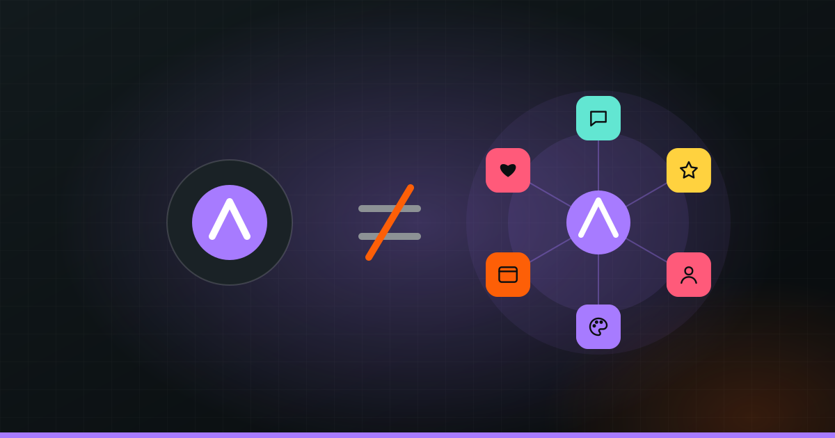
A logo is the mark that identifies your business. A brand is what people think and feel when they hear your name. The logo is your signature; the brand is your reputation. A logo can be designed in a few days. A brand is built over time by everything you do: how you look, how you speak, how you treat customers, and whether you keep your promises.
Mixing the two up is one of the most common and costly mistakes small businesses make. Here is the difference in plain terms, what a brand is actually made of, and how to tell whether you need a new logo or something bigger.
A logo is your signature, a brand is your reputation
Think about a person. Their signature identifies them on a cheque or a contract. But nobody trusts a person because of their signature. You trust them because of how they have behaved, how they speak, and what others say about them. The signature only reminds you who they are.
Businesses work the same way. Your logo helps people recognise you on a signboard, a box or an Instagram post. Once they recognise you, what they feel next comes from your brand. If past experiences were good, the logo triggers trust. If they were bad, the same logo triggers avoidance. Same logo, very different result.
What a brand is made of
Your brand is the sum of many parts. Some you design, some you live every day.
| Part | What it is | Example |
|---|---|---|
| Name | What people call you | Easy to say, spell and search |
| Promise | What you stand for and who you serve | “Healthy lunches for busy offices” |
| Logo | Your mark, in versions for big and small spaces | Signboard version and profile-picture version |
| Colours and fonts | The look people know before reading a word | One main colour, one accent, two fonts |
| Photo style | How your pictures look and feel | Bright, natural light, real customers |
| Voice | How you write and speak | Warm and simple, never pushy |
| Experience | What it is like to buy from you | Quick replies, clean space, on-time delivery |
| Presence | Your website, social pages, packaging, signage | All looking and sounding the same |
The first six together are often called your brand identity: the visible, designed side. The experience and reputation are the lived side. Strong brands make both tell the same story. For a longer look at this, read what branding really is.
Two cafés on the same street
Imagine two cafés next to each other. Both have nice logos made by good designers.
The first café uses its logo on the sign, cups, menu and Instagram, always in the same colours. The menu is short and easy to read. Staff greet regulars by name. The photos online match what you actually get. When they reply to messages, they sound friendly and helpful. People start saying “let’s go to our place”.
The second café has an equally good logo, but the menu is a laminated sheet in three fonts. Instagram posts use whatever template was handy that day. The coffee is good on some days and not on others, and messages get answered a day later. People do not dislike it. They just do not think of it.
The logo is not the difference here. The brand is.
Two clinics: where brand means trust
For a clinic, a school or anything to do with health or money, brand is mostly about trust. Take two clinics with similar doctors and similar fees.
One has a clear website that explains treatments in simple words, shows real photos of the clinic and the doctors, and lets you book on WhatsApp. Reception calls to confirm. Reports come on time, in a clean format with the clinic’s name and colours. Each small thing says “we are organised and we care”.
The other has a decent logo, but an outdated website, a Google listing with wrong hours, and handwritten slips. Patients may get excellent care there, but new patients choosing online cannot see that. They pick the first clinic.
Why mixing them up costs money
When sales are slow, many owners decide they need a new logo. They pay for one, put it up, and nothing changes, because the logo was never the problem. The real issue might be a confusing message, an inconsistent look, slow replies or a website that does not work on phones.
The opposite mistake happens too: a business spends heavily on ads while its look and message are all over the place. The ads bring people in, and the weak brand lets them walk out. Our post on signs your brand looks cheap lists the most common leaks.
Tip: Ask five regular customers to describe your business in three words. If their words match what you want to be known for, your brand is working. If they are vague, or all different, the problem is bigger than your logo.
When a new logo is enough
A logo refresh, which means tidying or modernising the mark you already have, is usually enough when:
- Customers already know, like and trust you.
- Your message and the type of customer you serve are not changing.
- The logo looks dated, or becomes unreadable when small, such as in a WhatsApp or Instagram profile picture.
- The logo prints badly, for example fine lines that vanish on a signboard or embroidery.
In these cases, keep what people recognise, like the main colour or shape, and improve the rest. You keep the trust you have built.
When you need proper branding
You need wider branding work, not just a logo, when:
- You are launching a new business or product and have nothing yet.
- Customers often confuse you with competitors.
- You want to move upmarket or charge more, and your look does not support it.
- You are expanding to a new city or country, or selling online for the first time.
- You are changing your name, or the kind of customer you serve has changed.
- Your look, words and experience are inconsistent across places.
Good branding starts with questions, not drawings. Who is this for? What do you promise them? How should they feel after dealing with you? Once those answers are clear, the logo, colours, fonts and voice can all be designed to say the same thing. Getting this right takes some thought and testing, because the answers shape everything that follows.
If you want help working out which one you need, that is what our branding team does, from naming and logo to voice, social pages and website.